Peer Review Samples for Data Visualization for All Trinity edX course
Section 2 Chart 1 Peer Review Sample
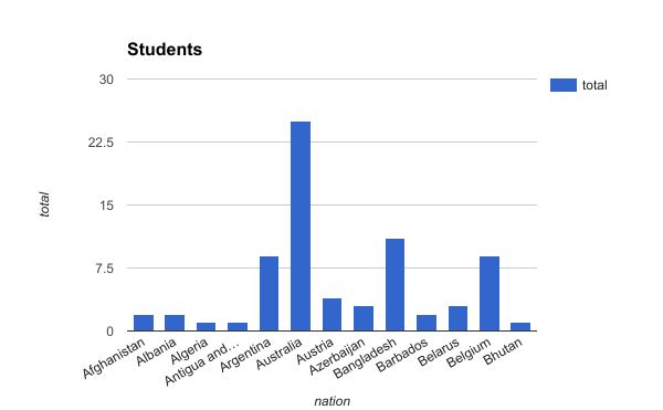
Students in the Data Visualization for All course come from several different countries, including Australia, Bangladesh, and Belgium.
Evaluate
- Story: Did the author clearly tell a meaningful story about the data, with text and visuals?
- Chart Type: Did the author choose a chart type that best matches their data story?
- Embed: Did the author embed an interactive chart into the web page?
- Good Design: Did the author follow principles of good chart design?
Section 2 Chart 1 Peer Review Sample with Notes
Students in the Data Visualization for All course come from several different countries, including Australia, Bangladesh, and Belgium.
Evaluate
- Story: Did the author clearly tell a meaningful story about the data, with text and visuals?
- No, this simple statement that students come from “several different countries” is not a very meaningful story.
- Chart Type: Did the author choose a chart type that best matches their data story?
- No. Although a vertical column chart is a good start, a horizontal bar chart would be a better match for these long labels.
- Embed: Did the author embed an interactive chart into the web page?
- No, when you try to float your cursor over the chart, it is a static image, not an interactive visualization.
- Good Design: Did the author follow principles of good chart design?
- No, the chart ignores several design principles, such as: - Failure to sort data into a meaningful order - Failure to declutter the chart by removing the unnecessary legend
Section 2 Chart 2 Peer Review Sample
Nations with the highest percentage of female students enrolled in Data Visualization for All are the Ukraine (51 percent) and Turkey (47 percent), based on preliminary data for those with high enrollment levels (25 or more students).
View the preliminary data for 21 Feb 2017 from http://handsondataviz.org
Evaluate
- Story: Did the author clearly tell a meaningful story about the data, with text and visuals?
- Chart Type: Did the author choose a chart type that best matches their data story?
- Embed: Did the author embed an interactive chart into the web page?
- Good Design: Did the author follow principles of good chart design?
Section 2 Chart 2 Peer Review Sample with Notes
Nations with the highest percentage of female students enrolled in Data Visualization for All are the Ukraine (51 percent) and Turkey (47 percent), based on preliminary data for those with high enrollment levels (25 or more students).
View the preliminary data for 21 Feb 2017 from http://handsondataviz.org
Evaluate
- Story: Did the author clearly tell a meaningful story about the data, with text and visuals?
- Yes, this insight on gender differences in student enrollments across nations is a meaningful story.
- Chart Type: Did the author choose a chart type that best matches their data story?
- Yes, this stacked horizontal bar chart is a good match for showing part-to-whole relationships (gender by percentage) between different nations.
- Embed: Did the author embed an interactive chart into the web page?
- Yes, when you float your cursor over it, the interactive chart tooltip shows data labels and values.
- Good Design: Did the author follow principles of good chart design?
- Yes, the chart demonstrates good design principles, such as:
- Sorting data into a meaningful order
- Using color contrast (blue vs grays) to highlight percentages of female students
Section 3 Peer Review Sample 1
My Leaflet map
My Highcharts scatter chart
Evaluate
- Leaflet map and title: Did the author embed an interactive Leaflet map with a new title?
- Leaflet map layers: Did the author add controls that toggle on/off different map layers?
- Leaflet point markers: Did the author upload a new set of markers, with pop-ups that show titles for each point?
- Highcharts scatter chart: Did the author embed an interactive Highcharts scatter chart with a new title and axis labels?
- Highcharts data tooltips: Did the author upload a new set of data, with tooltips that show labels and details for each point?
- Additional comments for the author. What works well? What could be improved?
Section 3 Peer Review Sample 1 with Notes
My Leaflet map
My Highcharts scatter chart
Evaluate
- Leaflet map and title: Did the author embed an interactive Leaflet map with a new title?
- No, the map title is the same as the original template, and is not new.
- Leaflet map layers: Did the author add controls that toggle on/off different map layers?
- No, the map does not contain layer controls.
- Leaflet point markers: Did the author upload a new set of markers, with pop-ups that show titles for each point?
- No, the map only contains one point, and the author did not upload a new set of points.
- Highcharts scatter chart: Did the author embed an interactive Highcharts scatter chart with a new title and axis labels?
- No, the chart title and axis labels are the same as the original template, and are not new.
- Highcharts data tooltips: Did the author upload a new set of data, with tooltips that show labels and details for each point?
- No, the author did not upload a new set of data points.
- Additional comments for the author. What works well? What could be improved?
Section 3 Peer Review Sample 2
My Leaflet map
My Highcharts scatter chart
Evaluate
- Leaflet map and title: Did the author embed an interactive Leaflet map with a new title?
- Leaflet map layers: Did the author add controls that toggle on/off different map layers?
- Leaflet point markers: Did the author upload a new set of markers, with pop-ups that show titles for each point?
- Highcharts scatter chart: Did the author embed an interactive Highcharts scatter chart with a new title and axis labels?
- Highcharts data tooltips: Did the author upload a new set of data, with tooltips that show labels and details for each point?
- Additional comments for the author. What works well? What could be improved?
Section 3 Peer Review Sample 2 with Notes
My Leaflet map
My Highcharts scatter chart
Evaluate
- Leaflet map and title: Did the author embed an interactive Leaflet map with a new title?
- Yes, the title in this map has changed from the original template
- Leaflet map layers: Did the author add controls that toggle on/off different map layers?
- Yes, this map contains map layer controls.
- Leaflet point markers: Did the author upload a new set of markers, with pop-ups that show titles for each point?
- Yes, this map contains new points that were added to the original template.
- Highcharts scatter chart: Did the author embed an interactive Highcharts scatter chart with a new title and axis labels?
- Yes, this chart contains a new title and axis labels.
- Highcharts data tooltips: Did the author upload a new set of data, with tooltips that show labels and details for each point?
- Yes, this chart contains a new set of data points that were uploaded to the original.
- Additional comments for the author. What works well? What could be improved?